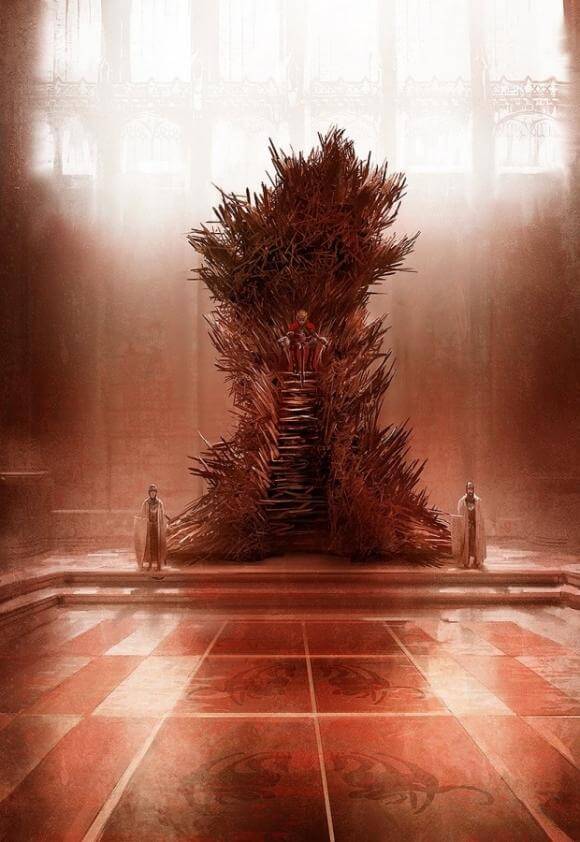
George R.R. Martin says this is the closest we’ve come to his Iron Throne
Game of Thrones has made the jump from popular book series to popular television show quite gracefully. Overall, fans of the book are in agreement that the series is treating the source material with respect, and while it may bend and meld characters and events together on occasion the show is staying fairly true to page. One thing that author George R.R. Martin says isn’t quite right is the Iron Throne, but he’s thinking the image above is the closest we’ve come to seeing his vision brought to life.
Read snippets of what Martin had to say about the image and his view of the real Iron Throne after the jump.
The author recently revealed on his Not A Blog (it’s totally a blog) the piece featured above, and he had this to say about the incarnation:
That’s the Iron Throne as painted by the amazing Marc Simonetti for the upcoming concordance, THE WORLD OF ICE & FIRE. It’s a rough, not a final version, so what you see in the book will be more polished. But Marc has come closer here to capturing the Iron Throne as I picture it than any other artist to tackle it. From now on, THIS will be the reference I give to every other artist tackling a throne room scene. This Iron Throne is massive. Ugly. Assymetric. It’s a throne made by blacksmiths hammering together half-melted, broken, twisted swords, wrenched from the hands of dead men or yielded up by defeated foes… a symbol of conquest… it has the steps I describe, and the height. From on top, the king dominates the throne room. And there are thousands of swords in it, not just a few.
This Iron Throne is scary. And not at all a comfortable seat, just as Aegon intended.
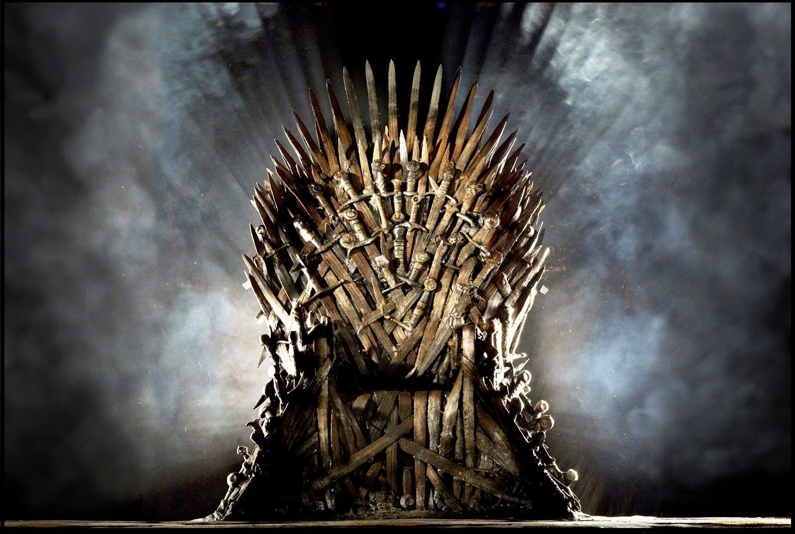
Here’s a look at the Iron Throne as seen in the series. As iconic as it is, this version is a bit polished and doesn’t have that raw edge Simonetti’s piece boasts.
More from Martin regarding the show’s Iron Throne:
The HBO throne has become iconic. And well it might. It’s a terrific design, and it has served the show very well. There are replicas and paperweights of it in three different sizes. Everyone knows it. I love it. I have all those replicas right here, sitting on my shelves.
And yet, and yet… it’s still not right. It’s not the Iron Throne I see when I’m working on THE WINDS OF WINTER. It’s not the Iron Throne I want my readers to see. The way the throne is described in the books… HUGE, hulking, black and twisted, with the steep iron stairs in front, the high seat from which the king looks DOWN on everyone in the court…
If only we could put a living projector into George R.R. Martin’s head ala a twisted Wild Wild West and see exactly what that brilliant man envisions in his Game of Thrones world. Here’s hoping he’s able to finish the book series before the show catches up!
What other bits and pieces of the series aren’t quite right when translated from the books? Feel free to share your thoughts in the comments.


