The Art of John Alvin is a must-own for film fans
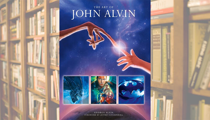
Once again, the great folks over at Titan Books have reached out regarding an upcoming release, and this time around it felt like a true privilege to get my hands on a copy of The Art of John Alvin. Seriously, if you call yourself a film fan and simply can’t find space on your coffee table for more than one book, make the one you own this fantastic collection. It hits physical and digital bookshelves early next week (August 26th).
The tasty sundae of being able to flip through the pages of the book came topped with the unexpected cherrie of getting to send a handful of questions along to the book’s author, John’s wife and widow, frequent collaborator, and extremely talented artist in her own right, Andrea Alvin. Together, John and Andrea are responsible for some of the most beautiful, unforgettable, and iconic movie posters and marketing campaign tidbits in the history of the industry, and that’s no exaggeration.
Take a quick peek inside the cover of The Art of John Alvin, and read a some sentiment shared by Andrea Alvin regarding her husband and the business, after the jump.
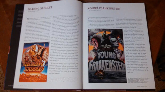
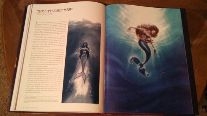
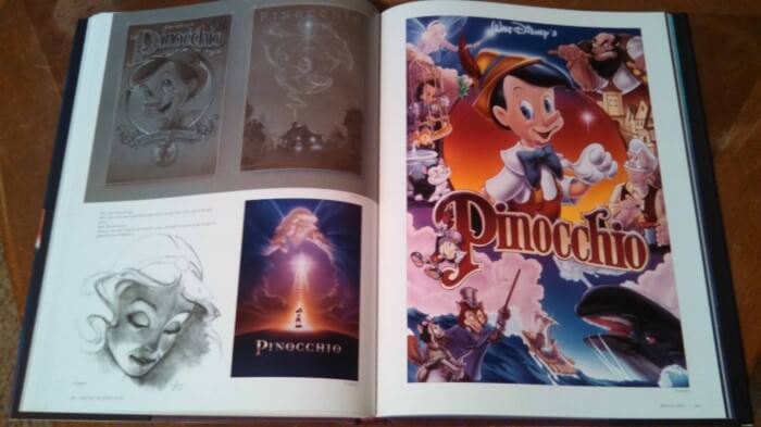
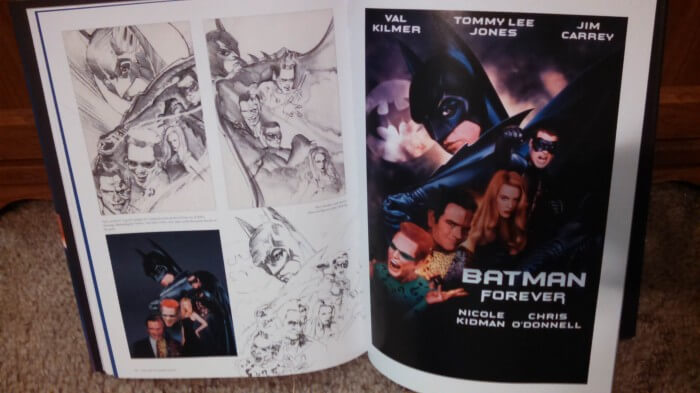
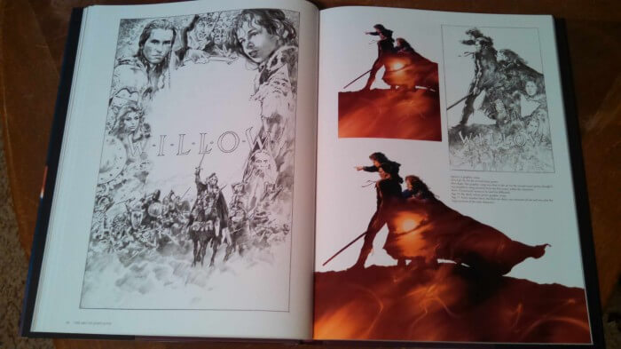
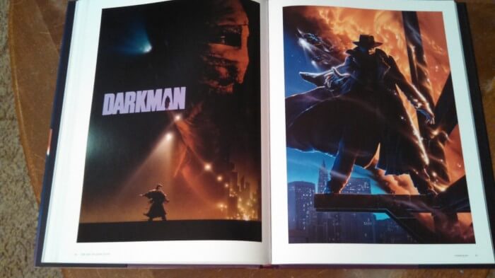
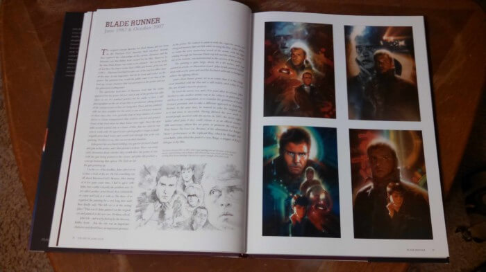
The best way to enjoy The Art of John Alvin is to sit down and take in everything each page has to offer (which is a lot). From the finished posters down to the concept art and sketches, the pages are packed with information about the conception and creation of each piece and the films and campaigns surrounding them. My coverage and sub-par photos really don’t do the book justice. That said, I was surprised and pleased when offered an interview opportunity with Andrea, and she was kind enough to answer a handful of questions I sent her way.
MMR: How long did it take you to collect the materials for the book? Is there anything omitted or lost that you wish you’d been able to include?
AA: The book took over four years to complete. The materials were difficult to find. In John’s early career, the jobs were coming fast and furious. There was no time to send a painting out to be shot, and the best we had was a polaroid. For the years that he was at Intralink Film Graphic Design, I was able to get color copies of those polaroids. Most were not useable. I did have transparencies of some work which were invaluable. In many cases the original art was missing or unavailable. It was quite a challenge. The size of the picture in the book was determined by the size of the reference that I had.
Of art that was included, I know there were many paintings for Young Frankenstein, but I had no access to any of them. I remember some really great ones. I would have liked to include Speilberg’s The Color Purple and Always. Mel Brooks’s Silent Movie and History of the World, Victor Victoria which was also used for the Broadway show, Princess Bride, and 10. There were so many good posters that I knew we couldn’t include everything.
MMR: Were you and John always film fans? Did it influence your art even before John’s first poster campaign?
AA: Both John and I loved the movies. I grew up in a small town in California and the movies were one of the major forms of recreation. John’s father was in the Army and they moved nearly every year of his childhood. The movies were a great outlet for his creativity and his vivid imagination. I have several paintings John did when he was about 11 or 12 years old, saved by his mother, that depict scenes from Spartacus, The Vikings, and The Time Machine. It appears that his career path was destined to be related to the movies.
 MMR: A follow-up: Favorite films? Did either of you have certain movies you could watch again and again? For what reasons?
AA: Every day in our studio, we would have a movie of the day. There were often favorites which we repeated often. The entire Godfather saga was one. It is a masterful story and beautifully filmed. Its a bit intense to watch while working, but after many viewings, we could probably recite most of the dialogue, so it was more listening than watching. John was a huge Star Wars fan, so that was another series we watched often.Then there were the comedies like Mr. Blandings Builds His Dream House, Funny Farm, Vacation. Charade was a favorite of both of ours. As you can see, there was no particular genre or era.
MMR: A follow-up to the follow-up: Which of the many, many campaigns he worked on was John most fond of? And you?
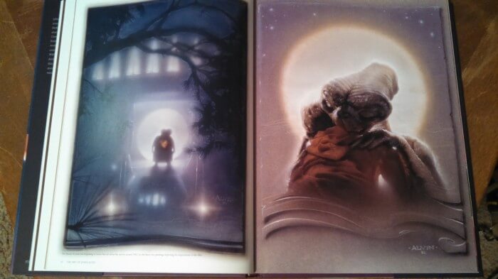
AA: John usually would answer that “ET was the big one that didn’t get away.” He worked on so many “big” movies, but ET was quite a phenomenon at the time. He used our daughter Farah’s hand as the model for Eliot’s hand in the poster. Many years after the movie was released, we moved into a house that we were told was in ET’s neighborhood. We watched the film to see just where it was filmed and it turned out to be our street and the Halloween scene was shot on the corner at the end of our block. For those reasons, it had a special place in our hearts.
 MMR: I can’t be sure the book ever explicitly spelled it out, but I was wondering which posters/campaigns the two of you officially worked on together.
AA: I began officially working with john in 1989 when we formed our own design company Alvin & Associates. I worked primarily on concepts and design. When digital was becoming more prevalent, I was doing the computer composite. The most well known of the films I designed were Batman Returns, Batman Forever, Cape Fear and The Mighty. Animated films that I worked on were Disney’s Pinocchio, Mulan, Hunchback of Notre Dame and The Little Mermaid; for Warner Bros animation Quest for Camelot and Cat’s Don’t Dance. There are more, but I think that’s enough.
MMR: Do you ever remember John being unhappy with any poster campaigns after everything was said and done? As a writer and artistic dabbler, I know I’ve come across past pieces that I wish I would have tweaked in this way or that. Did anything stand out as incomplete in a nagging, silly sort of way?
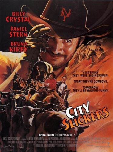
AA: There was one poster, which isn’t in the book, that he was not pleased with the result. That was City Slickers with Billy Crystal. The art director was quite young, and John had been hired by the man’s boss. This young man felt he had to prove his abilities by flexing his proverbial “art director muscles.” John was frustrated from the beginning and felt that he was hobbled by too much direction.
(Here’s a look at the City Slickers poster she’s talking about)
MMR: Did John ever delve into digital art? Was he a fan of the evolving landscape and the influence computers and new technologies have had on the craft?
AA: In 1989 I saw a demonstration of Photoshop, which had just been released. My reaction was, we have to have that! John had done many posters that were photo composites, such as Lost Boys and the Batman posters, where he did elaborate art work over them. Photoshop looked like the perfect tool for those. We bought a system and began learning. John felt the computer was just another tool in his arsenal like the airbrush. He became very adept at painting in Photoshop and eventually began doing his color comps on the computer before he completed a painting.
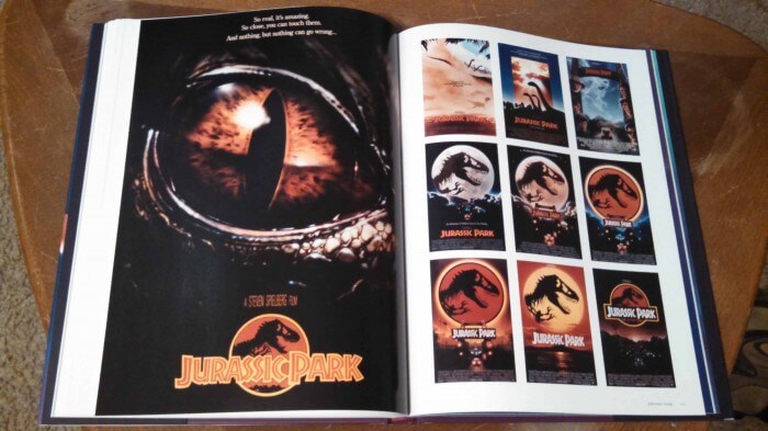
There are a handful of great pages dedicated to Alvin’s Jurassic Park work. They include some amazing examples of a lot of material that never made it into the final marketing campaign. The second image below, right page, contains 30 “grainy photocopies…all that remain of the scores of early comps we produced.” Talk about almost-lost pieces of film history!
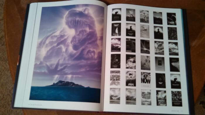 MMR: Were there any movies or popular entertainment properties that you or John wished you’d gotten your brushes into? Ever sit in a theater or sink into the couch in the evening and enjoy a movie thinking, “Wouldn’t it have been great to do X for that marketing campaign?”
AA: The big sci-fi fantasy movies come to mind, like the Hobbit movies, Hunger Games, and X Men, because John really loved those. The newest Godzilla would have been fun to work on. Sometimes while I’m at the movies, I will see a particular scene and think, there’s the image for the one sheet for this film. I often walk out of seeing a film and look at the poster and wonder if the designers really saw the film. There’s often no real connection between the two.
MMR: Are you still working in the film business? Contributing to artwork for marketing campaigns? I’ve seen your gallery of movie-themed pieces on your website. Are those more for personal enjoyment or were they pieces you did on contract?
AA: I have not been working in movie marketing campaigns without John. I am staying involved as an official artist for Warner Bros Fine Art and Disney Fine Art. It allows me to paint my own concepts using their licensed properties. I’ve had some great fun with making up pulp magazine covers for the Wizard of Oz, and hunting magazines for Elmer Fudd and Daffy Duck. The originals are for sale, and they are made into limited edition prints that sell in galleries across the country. From time to time I will do a painting of a film I love.
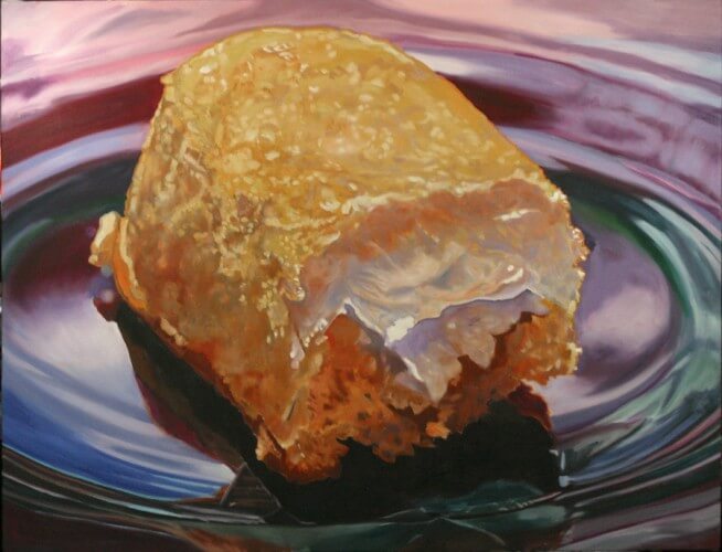
MMR: Your artwork seems almost as soft and subtle yet delicious and intimate as John’s, in its own way, and I was particularly entranced by your Guilty Pleasures series. Talk about tasty! Are your pieces and influences derived from owned objects and personal addictions? Meaning, are all the little knick knacks and tasty treats things visitors would see around the Alvin home?
AA: I have sworn off the Twinkies and cupcakes, but I still love painting them. My personal work has been mostly about nostalgia and creating portraits of childhood keepsakes. Sometimes that includes candy and fruit pies and sometimes toys and figurines. I must admit that those knick knacks are all ours. Its difficult to go to a flea market or an antique store without coming home with a “new” old object. John was a collector of many different things; model kits, Star Wars toys, figurines from movies, red shoes, or any little thing that caught his eye at the time.
Definitely hop over to Andrea’s website where you can salivate over her Guilty Pleasures series and check out much more of her work.
MMR: Lastly, did John (or do you) have any thoughts on the future of film or the artwork surrounding it? Can you recall any anecdotes about either of you discussing your future in or out of the industry?
AA: First of all, everything goes in cycles. When the economy is bad, creativity in advertising usually diminishes and perhaps for economic reasons, the posters for the films today are generally lackluster and light on conceptual thinking. This may change in the near future. As for the future of hand painted illustrated poster, I don’t know. If the studio marketing would allow time in the schedule, I think illustration is very appropriate for some films, as is photography for others. I know there are talented artists out there who could do a great job. Illustration allows the viewer to accept a bit of fantasy, where the photo solutions, no matter how much manipulation, are rooted in reality. John brought an energy and emotion into his paintings that set his work apart. I believe that the art John did for the movies should be regarded as fine art, as is the work of illustrators such as Norman Rockwell, Maxfield Parrish and N.C. Wyeth.
When the movie Snakes on a Plane came out, they wanted that “70’s retro feel’” so they contacted John. You know you’re getting older when you are considered retro. John thought it sounded like fun and he presented his list of terms. They agreed to everything he asked for…and then they sent a production schedule. It allowed about one week to complete the artwork. They didn’t understand that this had to be painted by hand and that it would take longer than a digital composite. They couldn’t give him enough time and he declined the job.We live in a fast food world. John and I compared movie marketing then and now, to to the difference between fast food and Mom’s home cooked meals.

